


The Interface of Assumptions
Eigengrau UX

❝The brain is a prediction machine. It constructs a world, and then lives in it.❞
— Anil Seth 1

The Quiet Colour of Darkness
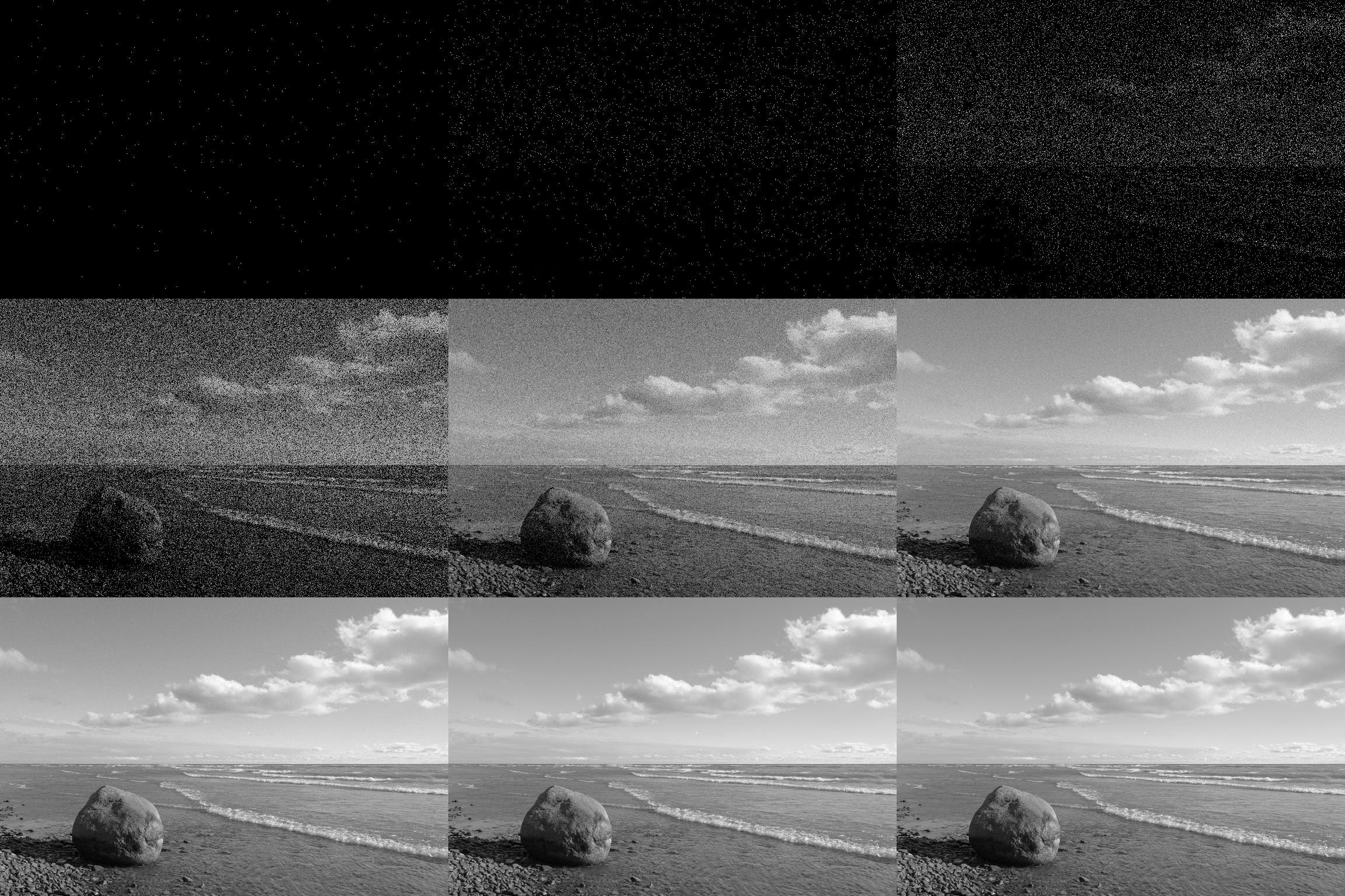
There’s a strange and beautiful colour we all see, but almost no one talks about.
It’s called Eigengrau2 —German for “intrinsic grey.” It’s what we see when there’s no light at all. Not black. Not nothing. Just a deep, perceptual fog conjured by the brain itself as if it refuses to accept the void.
No photons. No input. And yet—something.
This isn’t poetry, it’s neuroscience. Our visual system, desperate for signal, generates its own. The mind hates silence so much that it starts humming to itself.
In design, something eerily similar happens. When a screen shows nothing, users make up their own story. They assume. They guess. They hallucinate meaning.
Designing in these moments—when nothing is there, but perception insists—is where the real craft lives.
Eigengrau 101
Complete darkness ≠ true black. It’s that murky, perceptual gray, born of our brain’s rebellion.
Our minds won’t tolerate pure absence. They must fill it.
Result: a perceptual fiction—comforting perhaps, but often misleading.
UX’s Own Gray Zone
In product design, we often obsess over what we put on the screen—buttons, sliders, icons, delightful little micro-interactions. But the real test of thoughtful design often lies in what we leave out: the silences, the blank spaces, the moments where the system says nothing and the user must still find meaning.
1. Empty States → Visual Silence
Open a new app. No content. No welcome. Just an interface waiting for something—anything—to happen. For users, this isn’t neutral. It’s unsettling.
“Am I supposed to do something?”
“Is it broken?”
“Did I mess up?”
When the product gives no signal, the brain supplies one. Often inaccurately. A well-designed empty state is more than a placeholder—it’s a moment to teach, reassure, or spark action. A bad one is just silent rejection in Helvetica.
2. Defaults → Invisible Decisions
Defaults are meant to help. They speed things up and remove friction. But they’re also quietly powerful because users rarely question them.
A dropdown pre-selected for you.
A silent auto-save to a location you didn’t pick.
An opt-in you didn’t notice but agreed to.
When defaults are invisible, users don’t perceive them as choices. They just follow the path of least resistance—until something breaks or surprises them, and then, miraculously, it’s their fault.
3. Mental Models → The Folk Wisdom of Interfaces
Users carry expectations—taught by decades of software—and they apply them everywhere:
Logos go to homepages.
Trash cans delete.
Swiping left means “get rid of this, probably.”
When your product aligns with those expectations, things feel intuitive. When it doesn’t, it feels… weird. Or wrong. Breaking a convention isn’t a sin. Breaking it without explanation is UX malpractice.
Like Eigengrau, these design moments are never truly empty. They are quiet, yes—but pregnant with interpretation. If we don’t shape the silence, users will fill it in. And if we’re not careful, they’ll fill it with confusion, frustration, or distrust.
Good design isn’t just clarity
What Happens When We Don’t Shape the Silence
No feedback after pressing “Submit”? Congratulations: you’ve sculpted uncertainty.
Invisible AI operations? Users feel abandoned. Or fleeced. Surprise!
Silent failures, orphaned progress, hidden assumptions—these become stories users make up.
Often: “This thing is broken. And I blame myself.”
Design for the Gray—Intentionally
Empty states: make them friendly, useful, and unmistakably on-brand.
Defaults: mind the slipperiest slopes. Document decisions so users aren’t trapped.
Feedback: show it. Every click, swipe, and download—show some life.
Mental model support: Don’t force assumptions. Guide gently, or break them deliberately and clearly.
Edge cases: prepare them with humour or humility—no one likes feeling stupid, especially when it’s the product’s fault.

Seeing in the Dark (and Loving It)
We don’t design just what’s on-screen. We design the voids too—the silences, pauses, emptiness. And every vacuum we leave is an invitation for someone else’s interpretation. Usually the wrong one.
When we learn to craft the grey—choose what it says, what it feels like, or better yet, what it inspires—we stop letting silence speak for us. Instead, we give it a voice.
Good design isn’t just clarity. It’s the confidence to own the unknown—and to shape it beautifully.
Here’s to designing with intention, even—or especially—when nothing is there.
NK
☉
Anil Kumar Seth is a British neuroscientist and professor of Cognitive and Computational Neuroscience at the University of Sussex. A proponent of materialist explanations of consciousness, he is currently amongst the most cited scholars on the topics of neuroscience and cognitive science globally.
Eigengrau / [ay-gen-gr-ow ] - noun. intrinsic light; the colour seen by the eye in perfect darkness. Why it's not black: While black is the absence of light, eigengrau is a result of the brain's activity. The optic nerves, even in the absence of external light stimuli, send some signals to the brain, which the brain interprets as this specific shade of grey. The term comes from the German words "eigen" (own, intrinsic) and "grau" (grey). It's also known as Eigenlicht, dark light, or brain grey. Eigengrau is not a medical condition but a normal visual phenomenon. It highlights how our brains process visual information even in the absence of external light.